
Advertising is an art and I always take a critical eye given my minor in marketing in college and additionally earned a Master’s in Marketing Communications. It’s impossible to create a campaign that everyone equally finds effective and appealing, but that’s just the way people are.
I recently posted a disagreement over on Matthew’s blog in that I’d prefer United Airlines begin to advertise their fantastic international premium travel experience hard product. Show me the product and I’d be more apt to buy it. He disagrees and preferred United’s “It’s Time To Fly†campaign saying, “the commercial I posted above makes me smile and it make me think – about my experiences on United and life itself.†Two different perspectives, both worth their merit.
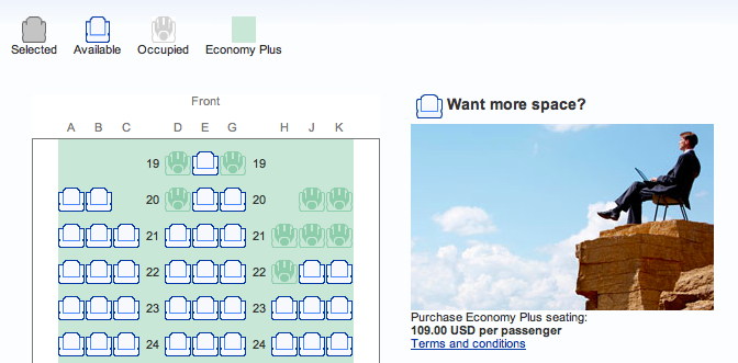
I’d like to take a quick poll to find out which of the ads appearing below for United’s Economy Plus appeals to you more.
Ad#1:
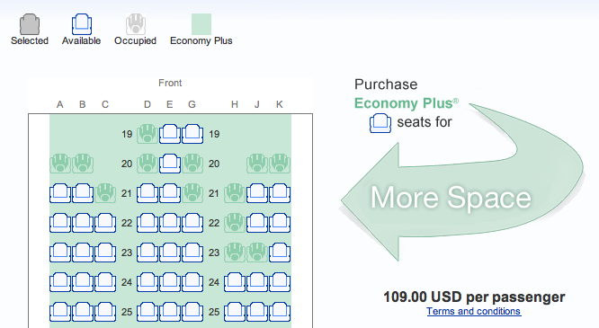
 Ad#2:
Ad#2:
[poll id=”2″]
Personally, I think the large “More Space†arrow with the price point appearing in a larger font is more effective and therefore more appealing to me. The picture in the top ad to me looks like it might be advertising something else unrelated to the seat map on this page.
What say you?
In this case, I like ad two! 😉
Hey, we agree on one! 🙂
Ad 2. BUT I still agree with Matthew that the “It’s time to fly” ads are way better than the crap out there now. But I understand they don’t resonate in all markets.
But look at Delta’s post-merger campaign “Keep Climbing”. I think that’s a brilliant campaign that mixes both the brand/image things with a concrete message about the product and people by littering in some facts here and there about lie-flat seats and wifi. But mostly it’s about the brand and the company.
I’d like to see United take a similar route post-merger.
Hopefully we’ll see a decent TV ad campaign come out soon. All the print ads right now are of the Continental-style, which I like.
While ad #1 evokes more of an emotion for me ad #2 is more effective at selling the EPlus seats.
#2 is an arrow. Wow. That really sells it.
#1 may be a bit unrealistic, but it conveys the point that there is “more space” in E+. So much space, flying above the clouds, that it’s like being alone by yourself looking over a cliff. It taps into emotions and imagination and all the other subconscious tools that create effective advertising.
Personally, I prefer the ads show a regular E seat and an E+ seat with an arrow comparing the leg room, but I’m hyper-rational and weird.
Actually, yes… that ad out there where United shows the difference between E & E+ is more appealing & would probably be better than the pic in #1.
I too was in Marketing & while I voted for Ad#1, neither Ad would have me spending more money for a seat. UA needs a new campaign…one that captures the travelers attention & then can convince you to part with extra money for a seat already paid for: Seat diagrams won’t do that.
1. A biz traveler who has to work & needs the seat tray to work on, in some comfort, might.
2. 6’2″ pax not wanting his knees in his lap, he might
Lots of scenarios to work from but they all involve people not diagrams.
Well, United does have a separate ad featuring an actual visual of the difference between economy and E+, usually appearing on the homepage. These ads, as you probably know, appear when you’re selecting a seat during the booking process. Maybe United would consider adding in a unique page to that process (like award accelerator today) that showcases the product & benefits.
While I am a huge PowerPoint fan of arrows and shapes, loving to do flow charts and presentations, I much prefer ad #1. I think it grabs one’s attention more, and I love the feeling of peace it evokes.
For me ad #1 evokes the feeling of an emotionless stock photo. #2 evokes the feeling of boring clip art. If I had to choose I’d say #2, only because it’s a bit clearer.
@gluedtothewindow: Good points. I would prefer what UA used to have–the cartoon guy with the 20 foot legs stretching out. I think those were more attention-grabbing.
United needs to make their ads more like Virgin Atlantic’s: http://www.youtube.com/watch?v=ebEDj7ZkOuA
Of course, only Virgin Atlantic can pull that off.
I do like that ad… would likely need to shrink it to 30sec here. It’s both sexy and “sort of” brings some of the cabin environment into picture.
Conceptually – ad #1 is nicer, but you have to adopt the mindset of the consumer at the time of messaging, which, to me would dictat the arrow as, at that point in the shopping process, I am looking for action/result, not to have my impression of a service or a brand influenced by imagery.