
Here’s an interesting look at the evolution of various airline logos, some going as far back nearly 90 years.
My favorites are Air France (1970-2004), American Airlines (1960-2013), Monarch (2002-2009), Qantas (1984-2007), Swissair (1981-2002), and the Saul Bass United Airlines design (1974-1993).
Which are your favorites?
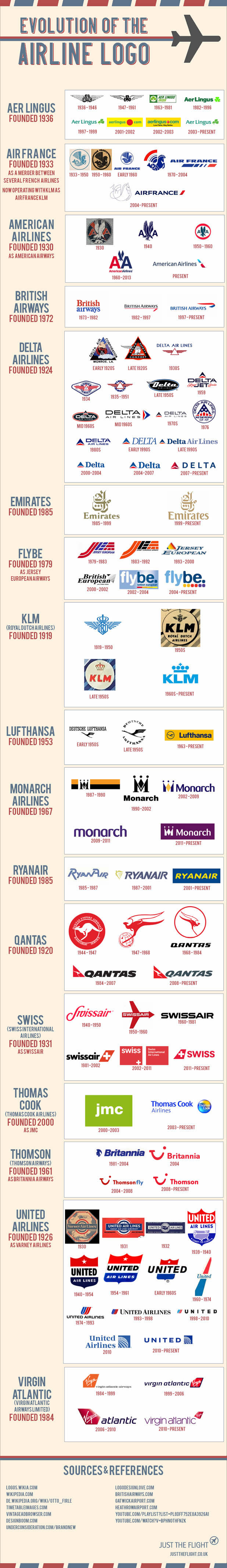
Thanks to @AirlineSector for tweeting this out yesterday, as I missed it when it was published last month. For the full-size version, click here.
– Follow Darren Booth on Twitter, @FrequentlyFlyin, for more airline, hotel and travel industry news, reviews and opinions.
Related posts:
Would This American Airlines Livery Have Been a Better Choice?
Cool chart! And good picks – I’m with you on those. Especially 74-93 UA. Also like 70s DL.
That’s cool. I did not know that Air France used to have an Iran Air style logo.
That was cool, thanks
It’s great thanks.
Please note though that Swiss International Airlines does not come from Swissair but from Crossair. When Swissair went bankrupt, Crossair bought the planes, routes and everything and changed name to become the national carrier to Swiss international airlines.
Can I use it on my blog (in French) though?
@Matthew: Great observation… those pre-1970 Air France logos are remarkably similar to present-day Iran Air.
@Philippe: Thanks for the background on Swiss/Crossair. The infographic came from Justtheflight.co.uk and they have an embed code that you can use to add it to your blog, as I did here.
How interesting. I had no idea that the DL and UA logos had change so much during my lifetime. And that early logo for BA…wow, that looks dated!
Thanks for sharing!
A little poor compilation . What a shame! Thak you indeed
Awesome infographic! Thank you for sharing