
United today released its long awaited new iPhone app designed specifically for Apple’s iOS7 platform. You’ll either love it or hate it, and I’m in the in-between “meh†segment.
At first glance, it looks like you’re using a Windows phone with their tiles and such:
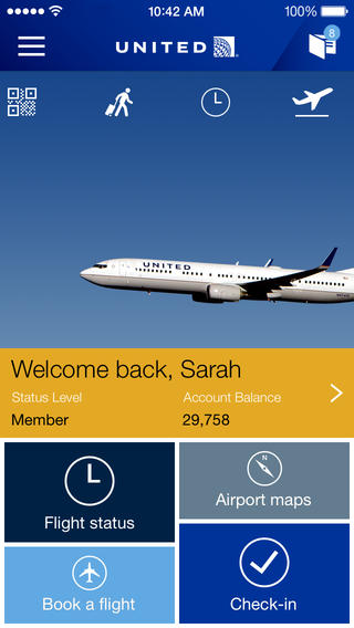
United iPhone app for iOS7
And to be nitpicky on the homepage’s aesthetics, why didn’t they show the entire 737-900 within frame? I can only image a new livery is in the works and they’re bringing the tulip back, not wanting to show the globe tail. Ha! I know… I’m dreaming. 😉
From United’s press release, here’s some of the marketing speak about the “improved design and functionality.â€
The new mobile app, which United designed specifically for iOS 7 and is fully functional on earlier iOS versions, updates its most-popular mobile tasks and introduces new features, including:
- Travel cards for mobile boarding passes, MileagePlus cards, United Club cards and other frequently used information that customers may display on the home screen and easily swipe through.
- Travel wallet, which holds relevant information, including upcoming reservations and flight status notifications, in a single location and enables customers to use a simple swipe and save details to the home screen.
The app, which the airline optimized for the iPhone and is compatible with the iPad, also enables customers to view seat maps more easily, purchase Travel Options and book award travel on multiple segments.
Customers may also use the new app to book and check in for flights, track a flight’s status and view MileagePlus information.
With the exception of the nifty Travel Cards and Travel Wallet sections (my 1K card doesn’t show my million-miler status, however), I’m not impressed. I was sort of hoping for:
- A Premier Status Tracker, similar to what’s found on their website
- Similarly, why not roll out a Premier Qualifying Dollar tracker since we’re only 1.5 months away from needing to track our spend for elite status.
- Where’s my lifetime mileage amount? And my MileagePlus enrollment date?
- Am I missing it, or does it also not show my Regional Premier Upgrade and Global Premier Upgrade balances anywhere.
Also, I guess it’s a matter of preference, but I liked the vertical seat maps as opposed to the new horizontal layout:
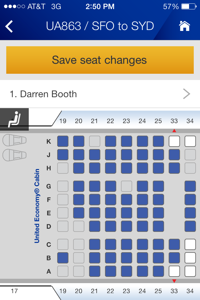
United iPhone seat map
Another annoyance was having to actually add my existing reservation(s) to the homepage icon, whereas they always populated there before automatically. I’m not sure if this was a one-time thing, or if I’ll have to do it every time when searching for a reservation in the app.
Anyway, this was my first pass through the app for a few minutes today and I might write a follow-up post in the future with a more thorough review. More information from United about the new app can be found on the United Hub.
What are your initial thoughts?
– Follow Darren Booth on Twitter, @FrequentlyFlyin, for more airline, hotel and travel industry news, reviews and opinions.
Related:
United Adds Spend Requirement for Elite Status in 2014
Massive Changes to United MileagePlus Awards in 2014
Recap of United’s Downgrades: Award Charts, ExpertFlyer and Meals
I think vertical seat maps are better for mobile devices, so that is a step backward, but not a particularly big one. I certainly think the app is cleaner looking, so I don’t think adding one more tap to see existing reservations is that big a deal.
Overall, I think it is a big visual upgrade, but functionally I don’t think much has changed, not that there was much to add functionally (although they did add the option to search for fully refundable fares now).
“Another annoyance was having to actually add my existing reservation(s) to the homepage icon, whereas they always populated there before automatically. I’m not sure if this was a one-time thing, or if I’ll have to do it every time when searching for a reservation in the app.”
You can always click on the wallet and click on the reservation itself. I find it cleaner especially when I have 20+ reservations plus other people that i’m handling. I can just simply add the next few reservations and keep everything simple. I’m using the app when i’m traveling and want things simple and not overly complex.
Besides that, I like the overall feel of the app. Seems a bit faster too and all the information (minus the enrollment date) was retained. The true test will be this weekend when I get to test this app on the road… we shall see then.
@Ed C. Thanks for the wallet tip!
@Mark: Ha! 🙂
@Chris: Good point about the visual drama of the asymmetry of the 737. I’d still rather see the whole plane, though. Just my preference. 😉
I love how the third review in the iPhone App store (incidentally a 5-star review) is from “Jim Compton”. Man, I think I heard of that name before… 🙂
I’m with you Darren, I’m all for the vertical seat maps…
I can’t speak at all to usability, as I’m stuck on the suddenly old-fashioned looking Android app. For what it’s worth, I like the asymmetry of the 739. It adds a bit of visual drama, like the plane is going to ascend up and to the left, which is reinforced by how it’s framed vertically.
Darren, I too missed the lifetime flight miles and premier status tracker. And I could not figure out how to get existing reservations to show on the travel wallet—the info I could find seems to indicate they should show automatically–I sent feedback about this. Definitely looks less fuzzy on my ipad mini than before.
You should consider updating your blog more. Your last post was over 10 days ago…
@Anita: I had personal and family issues preventing me from regular updates, but new posts are back on track (beginning today). Thanks for your concern.