
In the odd chance you haven’t already heard, American unveiled their new livery and logo today. American will no longer be able to sport a polished aluminum look as some of the new fleet types on order are made of composite materials, including the Boeing 787 Dreamliner. And so, at 9:00 a.m. CST today, American did their big reveal online.
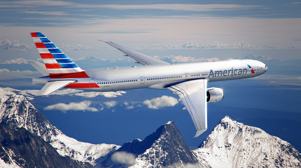
The New American Airlines Livery (Courtesy: American Airlines)
Twitter immediately became a flurry with reaction, most of which I saw was negative. I quite like the new look and it has grown on me even more throughout the day. Bold and modern, and it will certainly stand out at the airport. My only suggestion would have been to use the same blue color used throughout for the lettering. I’ll miss the current livery, though, as I think it’s a classic and stood up well over the years.
Change of any kind will bring criticism and one of the elements many are expressing distaste for is the new “eagle,†or what American is calling a flight symbol.
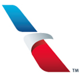
American Airlines logo (the 'eagle' or 'flight symbol')
And when American announced they’d be updating their look early in 2012, many designers got busy. Here’s one of the most widely liked concepts from Anthony Harding:
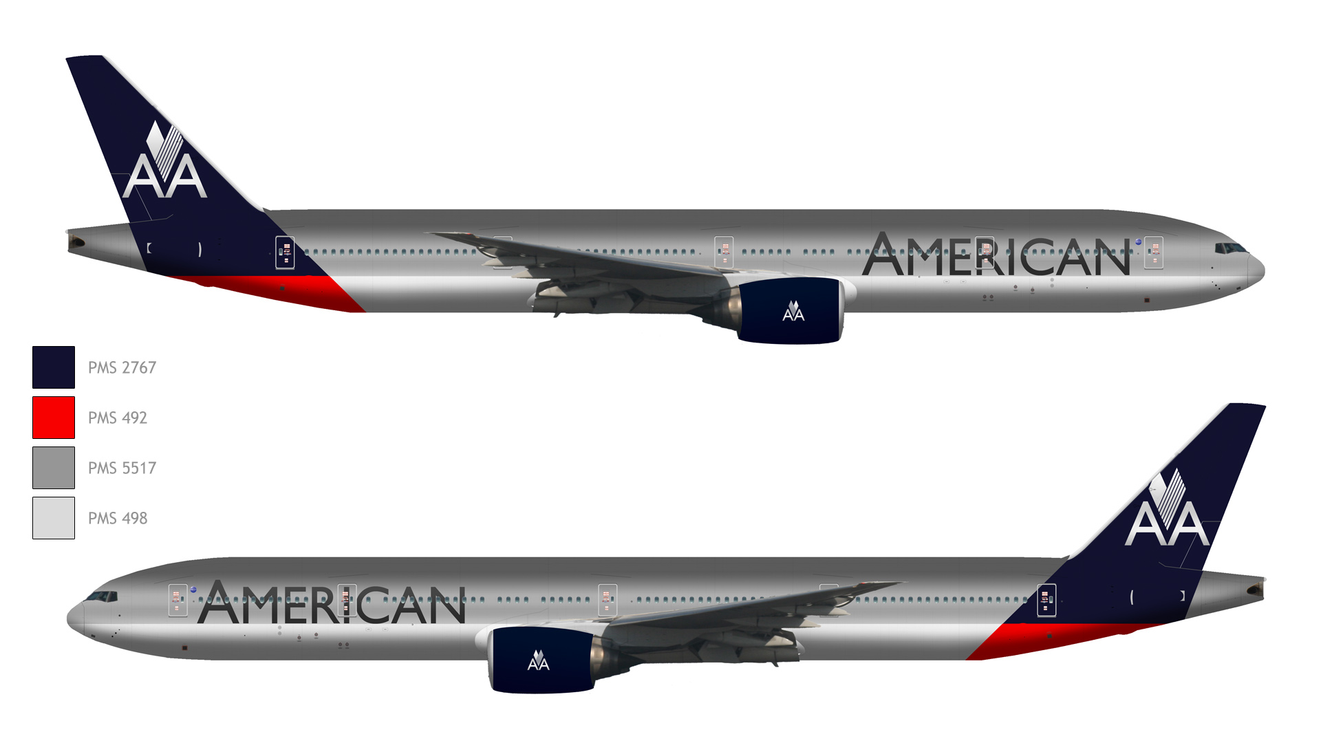
Courtesy: Anthony Harding
He modernized the eagle, maintained a red, white and blue (and silver) color palette, and even kept the popular “AA†going, I owe a huge thanks to Anthony for allowing me to show his design here and I asked him what he thought of American’s new look:
I’m highly impressed with what American Airlines revealed today. To me, it’s exciting, eye-catching, and it feels appropriate for their vision of a modernized American Airlines. Where so many modern airline liveries feel underwhelming to me and seem to lack passion, American’s bold new livery feels like an emphatic statement of confidence in the airline’s future.
A very nice critique indeed! But what say you? I’d love to hear your choice if you had to pick between the two. And I also welcome criticism of my own approval of American’s new look.
Related posts:
Review: American’s Flagship Check-In and Lounge at LAX
I really like the new look! It’s way better than what United did 😉
I like it. Fresh, with an edge. Good going AA!
I like the new livery much better than the dark blue tail around the AA that was proposed. But I would’ve preferred they kept the AA and perhaps jazz it up a bit, perhaps a red tail or both red and blue. The all dark blue tail wouldve been depressing.
That livery would actually go well if(when) usair and aa merger.
I don’t like either of them.
I was a big fan of Anthony’s concept and really liked the updated Scissor Eagle he designed.
As for the new livery, I think that American retained the best elements of their classic design and made them better. It’s a very bold look and I like it.
Anthonys look like Aeromexico to me
I like the new livery, looks fresh and sharp and really stands out. I am surprised they are investing in it before a decision is made regarding the US merger though, US may want to have something to say about it.
Is time of new AA logo looks a lot like AirFrance?
I like the majority of the new livery, it does look fresh & modern, but the tail does look like a merger with Bank of America.
I like Anthtony’s proposed better. Having worked in the branding and marketing space and having relaunched a couple of brands in my time, the official AA rebrand misses on a couple of fronts, for me:
1- Too many design elements: the gradient flag takes prominence over the new Eagle mark
2 – the eagle mark is too evocative of two other brands – Birdseye foods and the old greyhound logo
3- the blue they chose is a not an impactful, bold or strong blue, rather it is a soft, apologetic, non-representational blue – a shade that an insurance company, bank or hospital might choose
4 – interpretation of the 3d design elements rely too heavily upon in situ exposure to communication their finesse – they don’t translate well in to 2d media – which is how a lot of the this brand will be established.
Overall, I think Futurebrand missed HUGELY on this one. The look is amateur and appears to be driven by committee or too many cooks in the kitchen. Many of the designs, proposed by aviation fans, were much better attempts.
Had they used the new logo on the entire tail area instead of the stripes, I’d have been all over the new livery. But that stylized flag is just too distracting to me.
American laid an egg with its new logo & paint scheme. The head of the eagle looks like the next generation of the USPS’ logo. The gray American lettering blends with the dark windows, makes it look mottled. The tail is too busy, looks blurry. And the flat gray fuselage is blah. This is a failed attempt to be bold. Aeroflot’s new scheme is better. Seriously. TOGA, folks. American needs a look that conveys class & leadership. This one simply looks like somebody lost a bet.
I am a pilot with American and really liked Anthony’s concept. I was actually looking forward to the change. The chosen design is really a let down. AA wants to be and is a global airline. Why would you put your national flag on the tail? American’s name does receive recognition around the world but unfortunately, many countries like to burn the American flag. Seems like AA has just put a big target on the tails of our aircraft. I’m just hopeful that through the merger process with USAir, another change will be made. Delta made two livery changes in a very short period of time. Absolutely love Anthony’s rendering.
@Keith: Thanks for chiming in, especially since you’re an American employee. Very valid points, indeed.
I realize that change is needed. The old classic logo is timeless. The look proposed by Anthony is much more palatable and moves American forward while keeping many of the elements of the past. I hope the powers at American consider his bold and classy upgrade.
We now have a consumer driven response to the less than appropriate AA logo and tail…
on facebook surf to fix the tAAil…….
Already several hundred participants !
Captain America is ready to fight the bad guys. The tail design doesn’t look humble.
They should have gone with the other logo. This new one looks cheap and exactly where they are going. Have you flown them in the last rep years. Nasty employees both in flight and gate personnel. Just vile. You would think that you want to retain customers. Not drive them away. They can take a lesson from Delta. Old fashion kindness and customer service. Worst day at Delta is Americans best day. And what’s with their expiration miles for their premium
Members. Seriously. Join the rank of the living airlines on the US. I live in S Fla and refuse to fly AA I’d rather connect and be treated like someone. Wake up AA. You use to have a nice product. Listen to your customers
Anthony’s logo is 10 times better than the new logo. The new logo’s flag on the tail takes away from everything else on the plane.
it’s very nice the new logo of american
First, on Harding’s design: you can tell he’s a professional, from the strength of his own design to his generous praise of the new livery. But I feel that all upper case lettering and font at the front of the plane is too busy, and the balance of the tail composition has a color saturation and volume that sets it too close to those of Delta. I’ve also never liked the popular new theme of logos on engine nacelles; too much tagging.
Now for the new livery. First impression: solidly positive. Most controversial for me: the tail, only because I’ve yet to completely come to terms with carrying prevailingly-rudder designs below the rudder and into the fuselage space beneath it. It visually somewhat attenuates, places drag on, the vector of the plane.
Awesome new “flight” logo. Rakish, emblematic and retro (yet totally future). Balances, through color value, the aircraft forward of the “American,” both perfectly sized.
(The coincidence of a stylized U.S. Airways rudder flag with that of the new AA’s make this look a perfect way for the new integrated airlines to acknowledge one another.)
Great job, AA.
But I understand, also, that if the new AA flag were cordoned strictly to the rudder space, how generic and limiting that would come off. The two bold red stripes are a way to both accentuate the direction of the fuselage and match the bulk weighting of red stripe in the USA flag. So it really works.
now that they’ll murge with US airways it’s a real shame that they didn’t combine both logo’s.
As an ex-Us Airways employee the us airways logo will be greatly missed. It could have been great but this looks too Japanese to me…
By far the Anthony Harding concept , It keeps the well known AA , nice bold look with a touch of class , would have easily beaten Delta’s nice livery
I like the new look (long overdue), but Harding’s design is more elegant.
Make the tail blue….not the whole back of the plane.
Anthony Harding’s concept is much better.
Although I agree with FAIRTV to make just the tail blue and loose the blue and red that extend onto the fuselage. Also ditch the logos on the nacelles. And possibly change them to red instead of blue. As is, Anthony’s concept design reminds me too much of the Texas flag.
But it is much nicer then the actual new scheme.