As widely reported and reviewed, Google launched their much-anticipated Flight Search feature after having completed the acquisition of ITA Software. ITA’s Matrix Airfare Search tool is bar none the most robust and user-friendly way to search for airfares – everything from simple roundtrips to complex multi-city combinations – and it’s my go-to website where I build all of my itineraries. The only thing it lacks is the ability to purchase directly on the site and we’ve all been expecting Google to come out with an industry leading booking engine packed with bells and whistles. The product they launched, however, is anything but revolutionary and is completely underwhelming.
I’ll get into my thoughts on why they launched it as is later, but first let me take you on a mini tour. My very first time plugging in an itinerary was met with a rather unfriendly error message. I searched for a simple Los Angeles to Chicago roundtrip leaving this Saturday September 24, 2011 and returning October 9th.
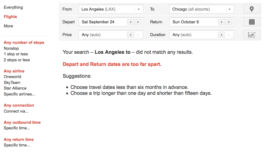
Image courtesy Google
I was surprised to see the current restrictions requiring the itinerary to be shorter than 15 days along with the other notifications mentioning a minimum one-night stay and a maximum six-month booking window. Very un-ITA. I revised my booking dates and played with the map feature, which is actually pretty cool.
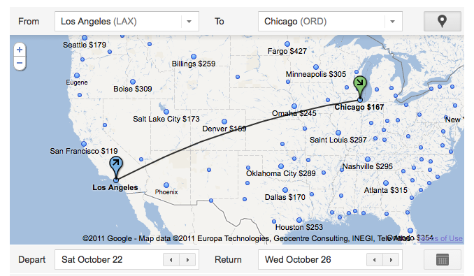
Image courtesy Google
It shows the rates to other cities in the United States for the same travel period, something useful if you also have your eye on another destination. As you can see from the map, only limited destinations are currently available and all within the U.S. One of the filtering tools allows you to set maximum price and duration (total travel time), but I think Google will confuse the average passenger here on how to manipulate the inputs, as well as what all those dots refer to.
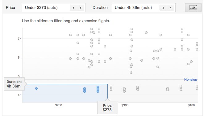
Image courtesy Google
It looks more confusing than it should and I think they need to take away the “hit†points and just focus on the key inputs of price and duration with a better explanation to click on the “sliders†to adjust the filter. Would everyone know what the “sliders†are in this graphic? I think not. Continuing on below, I found several unfiltered (didn’t use the left-hand pane delimiters of # of stops, airline/alliance selection, connection points and times) flights from which to select my outbound.
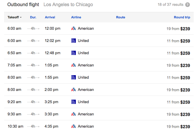
Image courtesy Google
Nonstops were highlighted, but I think they need to do away with the confusing notification of result pulls. When you hover over the question mark next to “18 of 37 results,†it reveals “Longer and more expensive flights are hidden by default, increase the Price and Duration limits to see more results.†Okay, but then the notices next to each roundtrip price makes it seem like you’ll find 19 results, for example, if you were to click on that first American flight showing a $239 fare. That’s not the case and Google should remove those notifications. I selected a United flight and went on to pick the return.
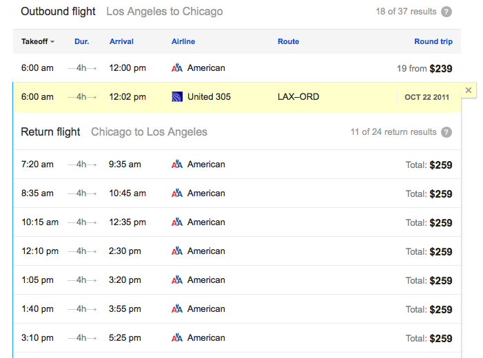
Image courtesy Google
What’s incredibly strange here is the display of American flights for the return having picked United for the outbound. I’m at a loss why that happened, but played along and picked one of the flights. Notice here, though, that those pesky result notices, “XX from†have disappeared next to the price points. Google currently steers you directly to the airlines’ website to complete the booking, so when the “book†button appeared, it advised me I’d be ticketing the reservation with American (probably due to the fact it was the last segment on the itinerary). Shockingly, when I clicked through it did indeed setup the itinerary as selected.
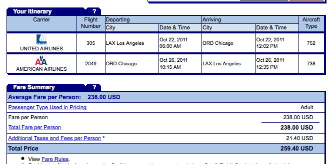
Image courtesy American Airlines
How unfortunate for American had I continued to purchase with a United segment. Here, though, I finally get to see the aircraft type, something totally lacking on the Google side and while it might not be important to most people, I’m keen to know that during the selection process. I played around a bit more and was thoroughly disappointed at how lacking this initial incarnation was. I will give credit to its speed and correct transfer of data to the airline’s site, as well as being able to see nearby airports with ease via the dropdown option from the default airport based on your IP address (I assume).
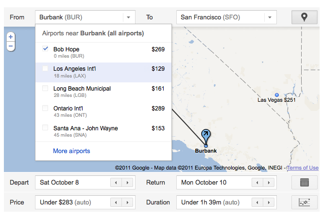
Image courtesy Google
The obviousness that you’ve selected an outbound and return just isn’t there, however, so Google absolutely needs better and deliberate notification to the user that you’ve actually selected one or the other. There is a ton more I could criticize, but for now I’ll leave this post as is knowing Flight Search is an ultra-early deployment.
So why did Google release such an inferior and restrictive product? My guess is they wanted real-world load testing and who better to “employ†as beta testers than you and me? Our initial searches will do wonders for their analytics. Also, I’m certain they wanted these types of critical reviews before releasing what I’m expecting to be the leading search and booking engine. They know what they have with ITA and I’m certain we’ll eventually have a tool used as frequently as you would use native Google for any other search.
For further insightful remarks well beyond my simplistic example, be sure to check out Henry Harteveldt’s guest post on CrankyFlier. He takes you a bit deeper into the pros and cons of this immature release and correctly states “Google launched the product too soon.†Have you tried it out? What are your comments?
P.S., Be sure to check out my review of a more advanced tool available now: Everbread’s Haystack Flight Search. No, I have not been paid by, nor have any stake in Everbread or Haystack. I was just as critical of their preliminary public release, but have seen true innovation for what the future holds by way of a preview of its actual functionality that is light years ahead of this Google embarrassment.


[…] since it was a one-time visit. I’ll base most of my description on Version 0.1 from a review Frequently Flying wrote back in September that called Google Flight Search “a total disappointment.” Significant changes have […]