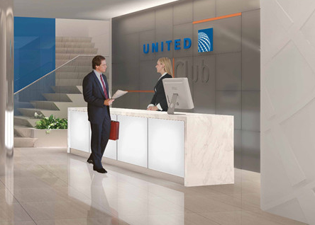
United smartly postponed their planned Twitter chat on Friday due to the horrific events in Connecticut. It was to discuss and debut the new look for United Clubs, beginning with the brand new Chicago O’Hare Terminal 2 location set to open next week.
The Chicago Business Journal ran their piece on the United Club redesign on Friday, which included a few actual pictures of the new T2 club.
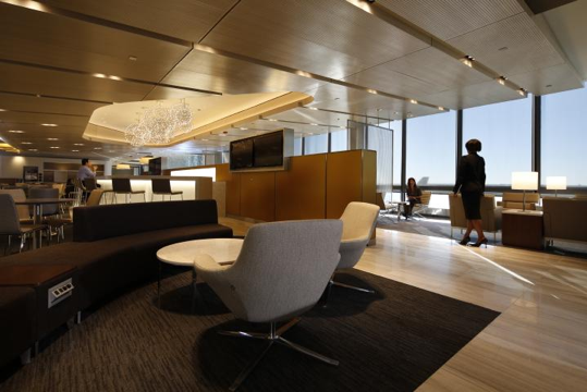
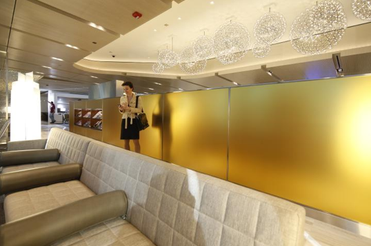
 I’m digging the color scheme and wood floor walkways. A crescent-shaped bar area appears to be located underneath the multiple hanging lighted globe chandeliers where someone is seated in the picture above. I suppose those monitors will broadcast television if that is indeed the bar area. Here’s the opposite side:
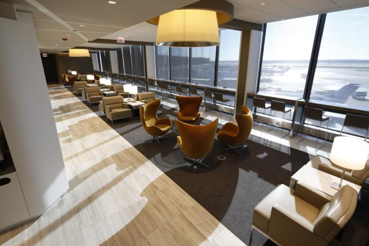
 The sizable bottom cushion of that long couch looks like it might prevent one from comfortably leaning back all the way. Are those circular armrest divider thingies movable? Probably not. I love the tarmac view and ample seating along the windows, complete with tabletop power outlets by the looks of it:
 The old United Club in the F-concourse of T2 will close (thankfully) once this 13,000-square foot mezzanine level lounge opens, according to the article. And United will be spending $50 million in 2013 to renovate additional club locations with the look of O’Hare’s new lounge being the template.
No word yet from United on when the rescheduled Twitter chat will occur.
Related posts:


Is the ceiling really low or is that woman unusually tall in third photo?
@Tom: Looks like a sloped ceiling to me.
I think part (or most) of it is also the perspective, and I agree that the ceiling looks sloped.
Deep couches and useless pillows are my two biggest hotel/bar furniture pet peeves. I really hope United re-thinks that one.
Other than that, I think it looks amazing. I’m happy to continue paying my United Club membership fee (via the MP Club Visa) if I can expect a quality product.
I don’t see any foot stools in those pictures. Guess the jobs of people who go around telling jet lagged travelers to keep their feet off furniture are safe after all.
i really don’t care how they look… they just need to put something more than junk food on the buffet.
They should take a design hint from the new LH Senator lounges at MUC & FRA