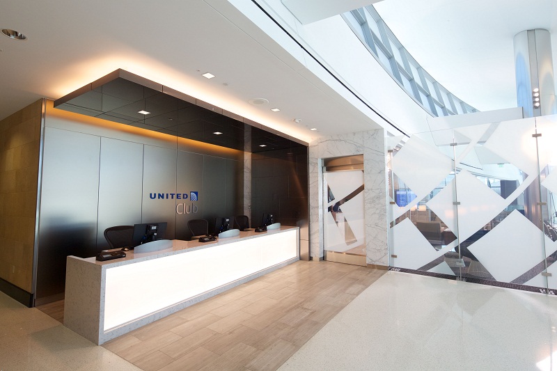
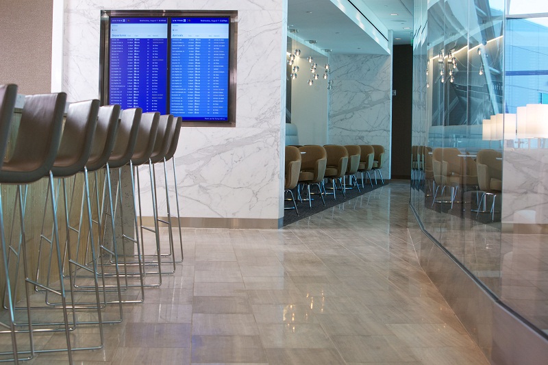
The new United Club lounge at San Diego International Airport opened this morning. It’s modeled after United’s first new post-merger location that debuted at Chicago O’Hare airport last year, and it looks fantastic based on the pictures from the press release.
The 5,842-square-foot United Club in San Diego is located in Terminal 2 West on the Mezzanine level, directly above the airport’s new Sunset Cove, an atrium that offers panoramic views of the airfield. The United Club features spectacular views of the Point Loma seaside community, balcony lounge seating within the atrium and a centrally located buffet and bar.
Check out the size of the globe logo on the entry door and accompanying glass:
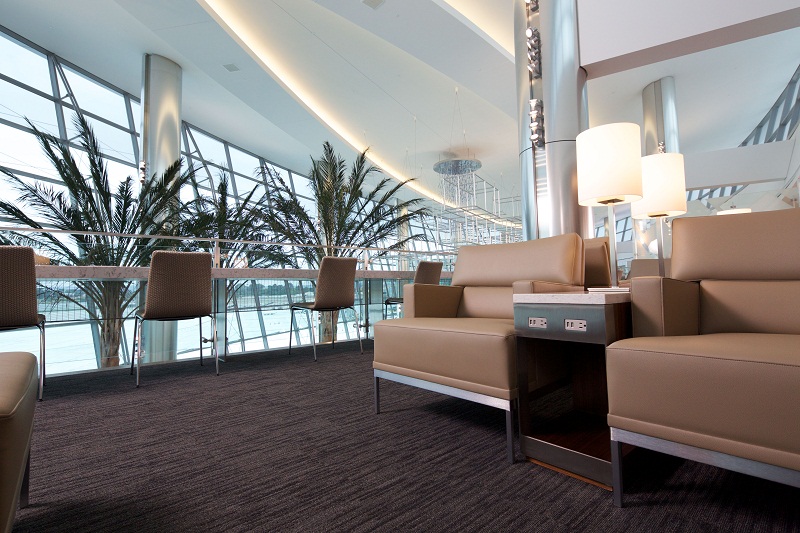
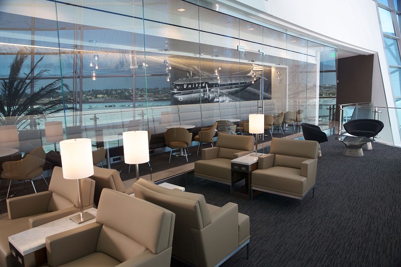
The seating area looks comfy with plenty of power ports and #AvGeek views of the terminal and apron. And is that a vintage Stratocruiser graphic in the second pic below?
The opening coincides with United’s consolidation of terminal facilities in the newly expanded Terminal 2 West at Lindbergh Field, offering a new ticketing lobby, baggage claim area and improved shopping and dining options.
Several United Clubs have opened or been refreshed at this point, including the aforementioned Chicago location, the Denver West club and a new Seattle lounge in Concourse A. In all, United is said to be spending $50 million this year to renovate many of its existing 49 locations.
– Follow Darren Booth on Twitter, @FrequentlyFlyin, for more airline, hotel and travel industry news, reviews and opinions.
Related:
First Look: United Club Redesign at Chicago O’Hare International Airport
A Quick Look at the Refreshed Denver West United Club
United Club Rate Increase and 3-Year Membership Discontinuation


What is it with North American airlines and their ability to design lounges that have the appeal of mortuaries?
A splash of glass does not hide the hideous amounts of brown
This, IMHO, is what lounges should be like….
http://cms.ukintpress.com/UserFiles/Virgin%20america%20lounge.jpg
or this
http://travelbulletin.org/wp-content/plugins/rss-poster/cache/4966a_120730104833-airport-lounge-lufthansa-horizontal-gallery.jpg
etc…
What’s wrong with a splash of color?
Very nice! Can’t say I’m always a fan of the open designs that let in terminal noise, but it does seem much more spacious than some other locations.
having just experienced the new UA Club in Chicago’s T2….I must say I like the new fresh clean lines of these designs…BUT I hope that when they redesign other clubs in the future…that they are not carbon copies of each other!
I like the modern tones – echoes of Lufthansa Senator and Air Canada Maple Leaf lounges – NICE>
@woggly: U.S. lounges will never compare to their overseas counterparts (unless Virgin America takes over domestic flying, which is unlikely). Their LAX lounge (your posted link) looks quite nice… and of course what could compare to Lufthansa’s First Class Terminal? 😉
@Scott: I’ll take the terminal noise for a view of the apron!
@Andrew: I like the “fresh” look, too, but I’m particularly pleased with the ample power outlets. 🙂