
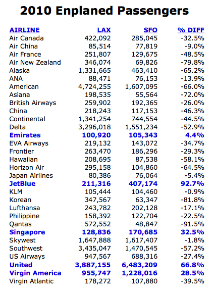
I recently took a look at some of the detailed passenger data for both Los Angeles and San Francisco airports and compiled the chart & graph below. Los Angeles is the third busiest airport in the United States behind Atlanta and Chicago, and handled about 59 million passengers last year. San Francisco comes in at the ninth spot with about 39 million passengers for 2010. If you’d like to see where your home airport ranks, the Airports Council International provides a nice summary on their website.
Given the fact that LAX handles about 50% more passengers annually than SFO, the chart below shouldn’t come as a surprise. An airline’s route network, frequency and aircraft size all come into play, so while this isn’t an apples-to-apples comparison in that respect, it’s still an interesting snapshot of market share by carrier. Also coming as no surprise is United’s dominance in San Francisco enplaning about 6.5 million passengers last year. One quick note about the chart and graph below is that I only looked at passenger departures (includes transit passengers re-boarding a new flight) for select airlines, and didn’t include passenger arrivals.
San Francisco airport also provides region data for departing passengers and here’s a snapshot of where those 6.5 million passengers on United flew.
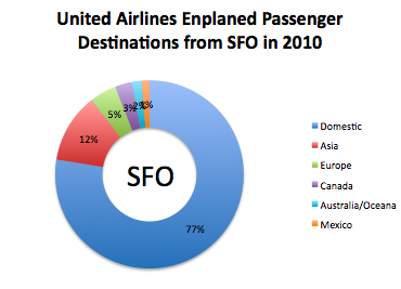 Next time you’re flying through San Francisco on United, nearly 1 in 4 passengers you walk by are headed somewhere other than the United States. If you haven’t guessed by now, my level of interest in all things airlines & airports is so deep that I enjoy putting things like this together. If you have a request for similar info for a different airport or airline, let me know and I’ll see what’s available publicly.