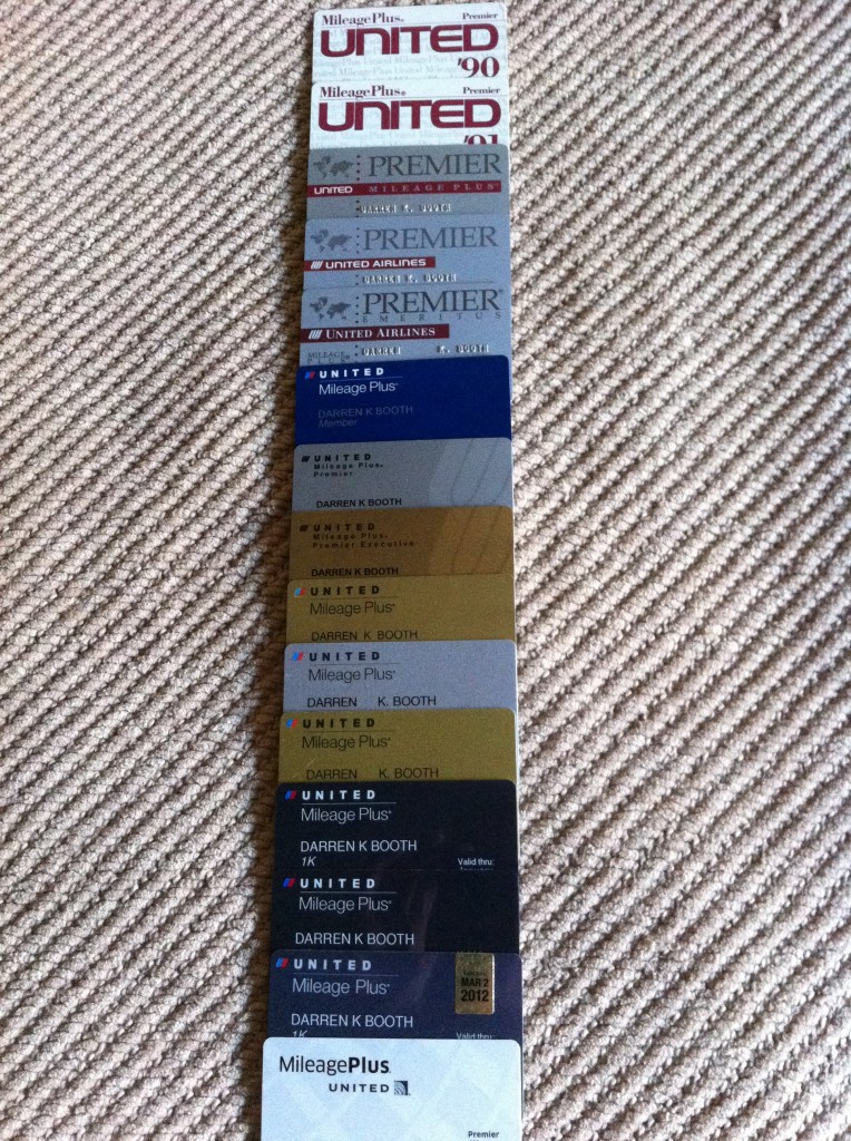
If you haven’t already figured me out, I’m an airline geek to the max and save absolutely everything related to my travels. As such, I’ve kept every frequent flyer card issued to me from any airline no matter its expiration. My favorite, quite honestly, is my Pan Am card, but given I received my new United Airlines MileagePlus card yesterday, I thought I’d share a look at how its design has changed throughout the years.
My favorite was the 2002 edition with the United tulip featured on the right-hand side of the card. Sadly, I lost my original Mileage Plus card when I signed up in 1988… it was blue and looked very similar to the 1990 Premier card you see at the top. What’s your favorite design?
P.S. I worked in the industry — including United — from 1995 (the fifth ‘Emeritus’ card below) through 2001, so lost status and received the blue card as a general member of Mileage Plus.


Love this but I think you fly too much… WHAT AM I SAYING?…. you can never fly too much right? Kool post. Back in my day I was always back in coach. Ugg…
Thank you for posting, it is a great history lesson.
Best,
PedroNY
Just curious, what’s the percentage of MR in your total miles you got every year.
You had misplaced the middle blue card, that blue card doesn’t belong to that period.
@ORDnHKG: Good eye! I think it was issued to me after I dropped to no status in 2004.
this is pretty great
Dude, I *love* this!!!! i was looking to see what MP looked like in the past, and wow! I get the whole lot on up to today! holy smokes, dude, you are so cool. i wish i had my card from when i was a ‘lil kid in the mid 90s =(
Love it! Cool progression of time.