A web usability surveyor based in Amsterdam named Usabilla just published results detailing user experiences on airline, hotel and Online Travel Agency websites. Participants were asked to perform simple tasks, such as “where would you click to get your boarding pass,†and leave additional comments about layout and other site features or functions. The full report can be downloaded here, but I’ll sum up some of the findings below.
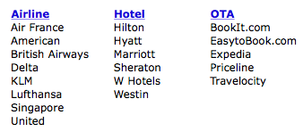
A total of 800 people took part in the study that specifically looked at the following websites:
 Airlines: Many participants specifically called out they hated advertisements on airline websites and several remarked they’d prefer to see all-in pricing instead of “from†rates that often exclude taxes and fees. Delta won the best score for speed and accuracy for the “where would you click to get your boarding pass†question with KLM coming in last. Maybe because I’m so used to it, but one person said United has too much different info on the homepage and it should be simplified. I actually think United’s landing page is just about ideal.
Hotels: Here the survey takers were asked to click on things that made them trust the website and other items they liked and why. Many specifically called out the strength of the brand through their logo, as well as clear contact information and the legal mumbo jumbo found in the privacy policy and other areas. Things they liked included luxurious scenes in pictures, ease of navigation and clear identification of other hotel brands within the chain. Unpopular here were testimonials, social media buttons and a cluttered design. There was really no winner or loser here as the purpose wasn’t to rank the appeal or functionality of each site, but Hyatt got some praise for linking to their YouTube page. I don’t get it really, because most of the videos there are just plain cheesy.
Online Travel Agencies: For the OTAs, users were asked to click on things they liked and those that they would remove. Most popular of the likes was the search functionality, telephone contact numbers and popular destinations. Expedia’s ‘deals and offers’ were well received, but the similar category on other OTAs failed for whatever reason. It seems absolutely everyone hated the Facebook ‘Like’ & connection and find it a ridiculous thing to include. Also not well received were areas or ads promoting site functionality and “buttons†that are really advertisements. There’s also a love-hate relationship with Priceline’s William Shatner (30% clicked him for a thing they like, 23% for dislike) and Travelocity’s gnome (29% like, 19% dislike).
This study was rather limited in scope with just a couple of questions asked per website, but it was still interesting to read over and I’d be more keen to take this type of hands-on visual survey method over the “on a scale of 1 to 10†type.